
Seed catalogs are arriving in my mailbox almost daily now. Some go directly into the recycling. Some go into the basket of magazines and catalogs near the door for perusal at a later time. Some come into the house with me for immediate consideration.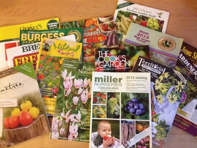
What differentiates these catalogs is not the content (though I do tend to favor organic and heirloom seeds over the conventional variety). What differentiates these catalogs is their aesthetics.
First there is the size. Seed catalogs come in all sorts of sizes. The catalogs that are in large tabloid sizing go immediately into the recycling. That size is just too cumbersome. They are hard to hold. I can’t easily sit in bed or in a comfy chair and pore over each page. The bottom crinkles on my lap and gets creases in weird places unless I hold the catalog higher, but then my arms get tired. It is just not worth the bother. So into the recycling they go.
The other sizes are much more manageable. There is the traditional magazine size, which is reasonable to handle. Then there is a smaller size – a bit taller than a paperback, but not much wider. All these catalogs deserve a look.
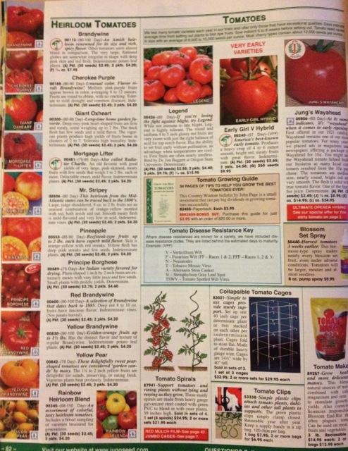
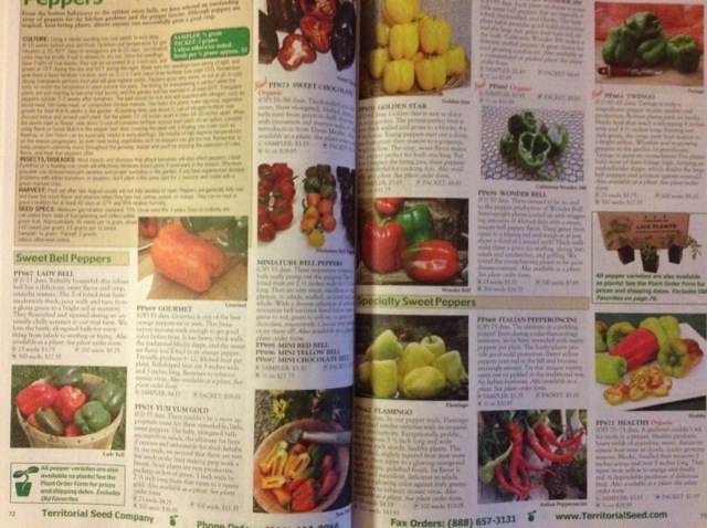
Once I have determined that a catalog is worth looking at, I open it. Now comes the next differentiating criterion: the layout of the interior pages. Some catalogs are crammed full of little pictures of plants on each page. Accompanying the barrage of little pictures is the tiny font that describes the seeds. When I look at such pages there is an overload of information. I have to strain to read the type. I get agitated. I cannot relax and enjoy the experience of savoring each page. Into the recycling they go.
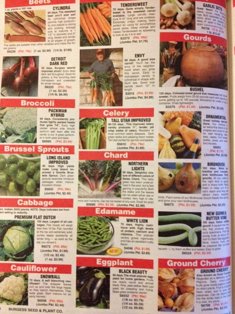
Often associated with the amount of information on each page is the amount of color on each page. Sometimes the colors are much too bright. Sometimes there are just too many colors crammed together on a single page. I much prefer more muted colors and a more coherent color scheme. So if the colors in a catalog disturb me, into the recycling it goes.
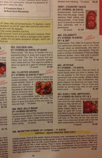
Some catalogs try to catch your attention by highlighting certain seeds as award winners or the catalog “choice.” All those extra icons and symbols make the pages look messy. I particularly dislike those catalogs that are alarmist in nature and pronounce that this will be your “last chance” to purchase some seed variety. Really? It will be my last chance ever? Are those seeds going extinct? Into the recycling these catalogs go.
So now I have pared down my selection of catalogs: they are of a reasonable size, and they have a reasonable number of selections of seeds on each page and a soothing color scheme. Now come some finer distinctions.
Catalogs are printed on different types of paper. Most of them are printed on glossy magazine paper. Some are printed on rough, grayish newsprint paper. I must say that I do prefer either white paper or glossy paper, though I feel that I should like the newsprint best. (Is newsprint more biodegradable?) Though I have a preference for the type of paper, I don’t dismiss any catalog simply on that basis.
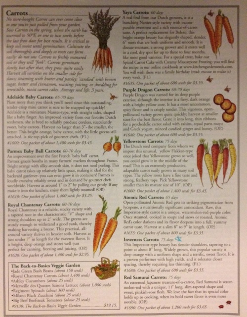
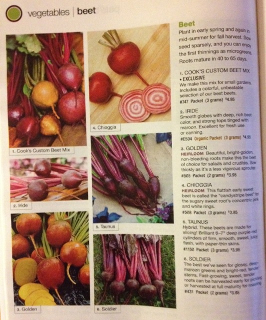 Some catalogs have text boxes that discuss planting tips and germination times in addition to the description of the seeds that they sell. This is all helpful information. My estimation of those catalogs rises.
So, you may be wondering by now what is my favorite catalog. I am not sure that I can answer that. There are several catalogs that I enjoy perusing and from which I purchase seeds.
However, if I were to select a catalog for purely aesthetic reasons, there is one catalog that stands out above the rest.This catalog is magazine sized, with just a few seed selections on each page. The color scheme is very muted. In fact, many of the pages are just charcoal print on white paper with dusty green headings. The paper is white but not glossy, heavier than regular laser-print paper, but not as heavy as cardstock. And there are no photos at all. Instead, there are drawings, some in color, some just in that dusty green color.
Even though this catalog is not packed with seed selections, it gives me the impression that the seeds that are offered have been carefully chosen. The presentation is beautiful. I’ve already started starring those seeds I am interested in getting. And I am sure that I will look at this catalog, John Scheepers Kitchen Garden Seeds, over and over again.